Website design case study
Ecomup is a marketing team I created and led. We offered almost every digital marketing service an e-commerce brand would need, but our signature service was custom Shopify website design. We needed a website that conveyed our messages: "Stand Out from the Market." & “Don’t be boring, be memorable.” Our services were all about making brands unique, so our own website had to reflect that—while also being optimized for high conversions.
discover step
Who’s the Ideal Customer for Camel?
The first step was understanding Camel’s ideal customer. However, the managing board didn’t focus on this aspect, as they primarily wanted a website that followed the structure of their key competitors. Given their main clients were middle-aged business owners in the F&B sector, I shaped the design direction to appeal to this audience. This meant avoiding an overly sophisticated approach and instead creating a look that resonated with their industry and target demographic.
What do competitors do?
Competitors focused on delivering an experience that was heavily branded, ensuring their websites were not only visually striking but also instantly recognizable. Their goal was to create a strong brand presence through cohesive design, bold visuals, and a narrative that reinforced their identity.
What style did Camel opt for?
Since the Camel team couldn’t articulate exactly what they wanted, I provided them with numerous market examples to help them make a more informed decision. In the questionnaire, I included a diverse selection of websites—even beyond the marketing and media buying field—to identify the key elements they liked or disliked. Once I gathered their responses, I compiled a moodboard to establish a clear design direction, aligning it with the structure of the competitor websites they referenced.
plan step
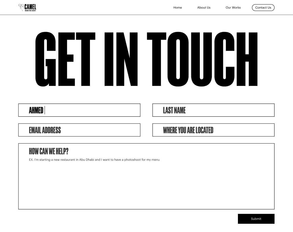
Writing the website copy
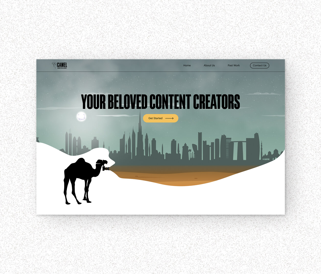
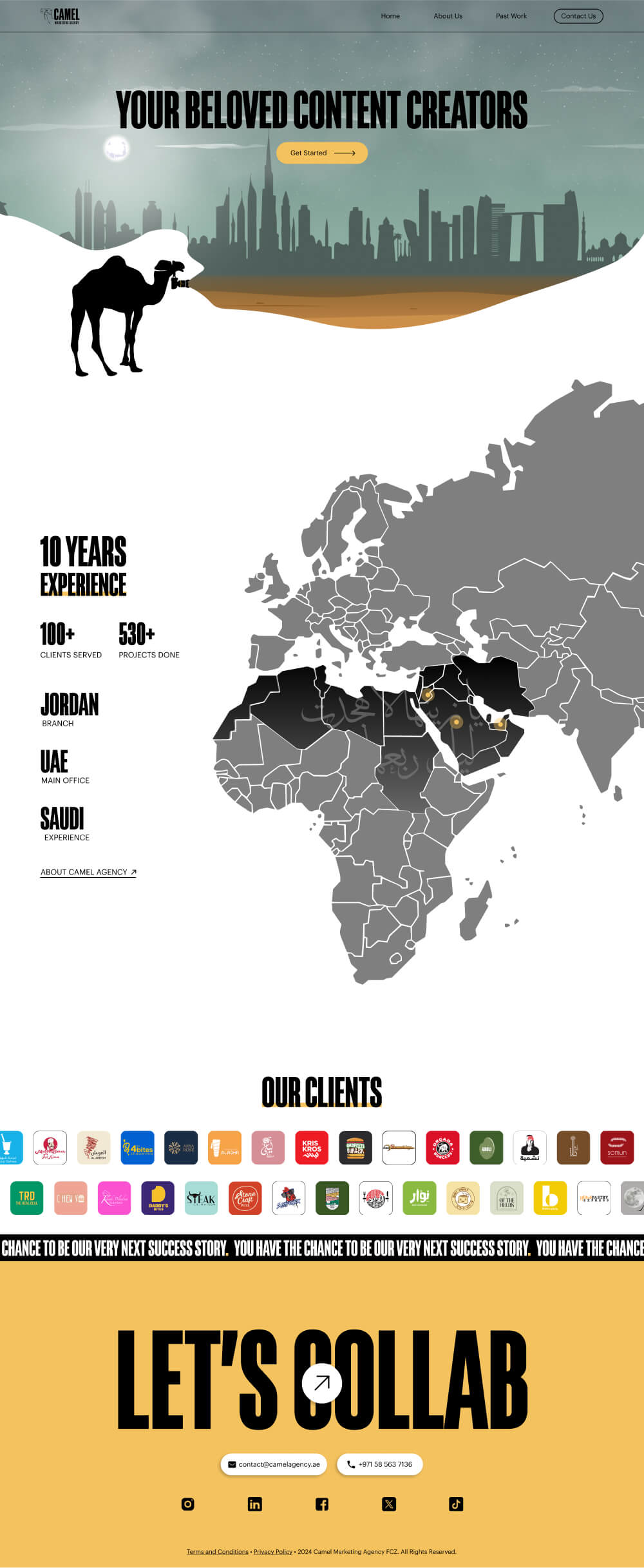
For the website copy, I crafted multiple versions to explore different tones and structures. One version followed a storytelling approach, another was purely informative, and a third blended both styles. To maintain brand consistency, I used their motto as inspiration for key headers and even incorporated it directly as a main headline: "Your beloved content creators."
Planning out a wireframe
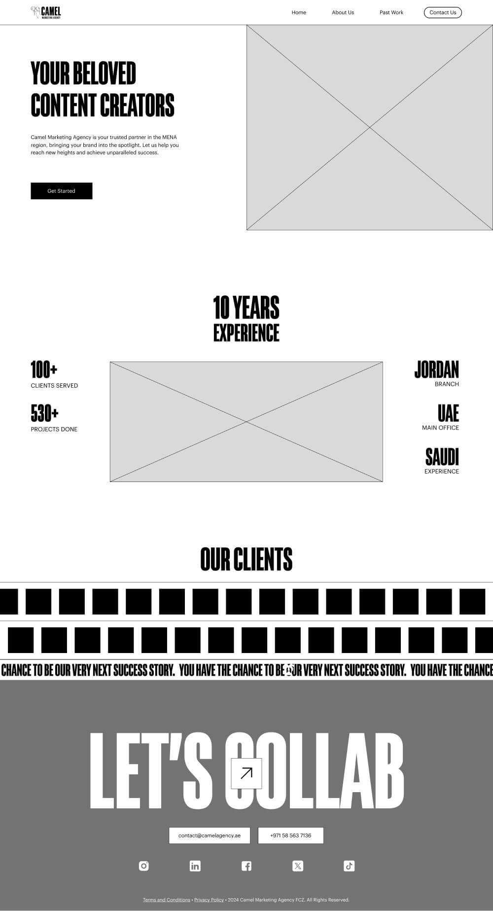
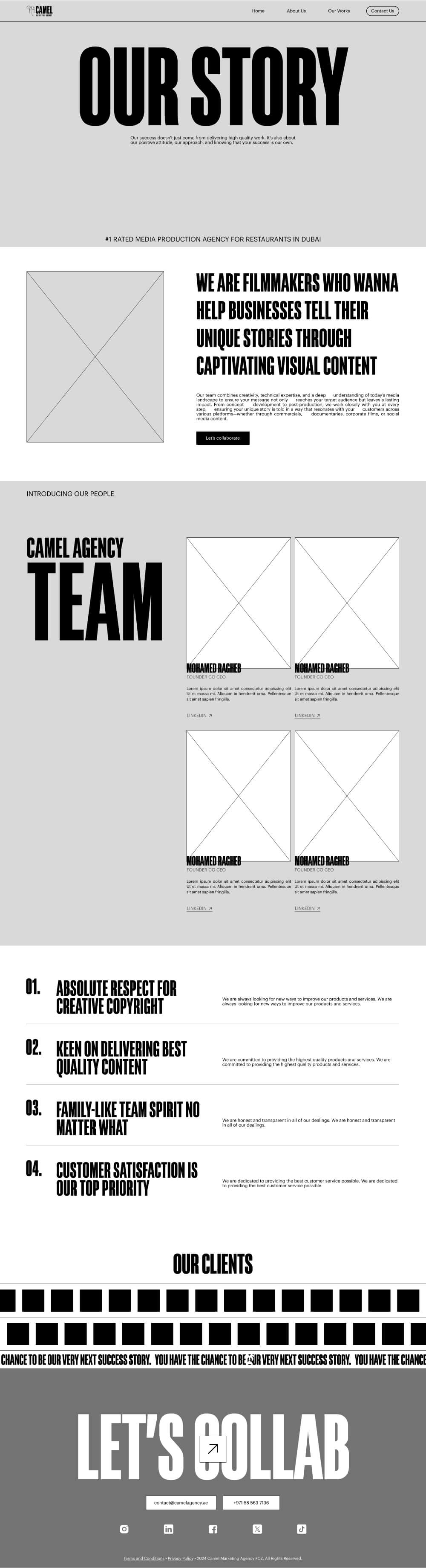
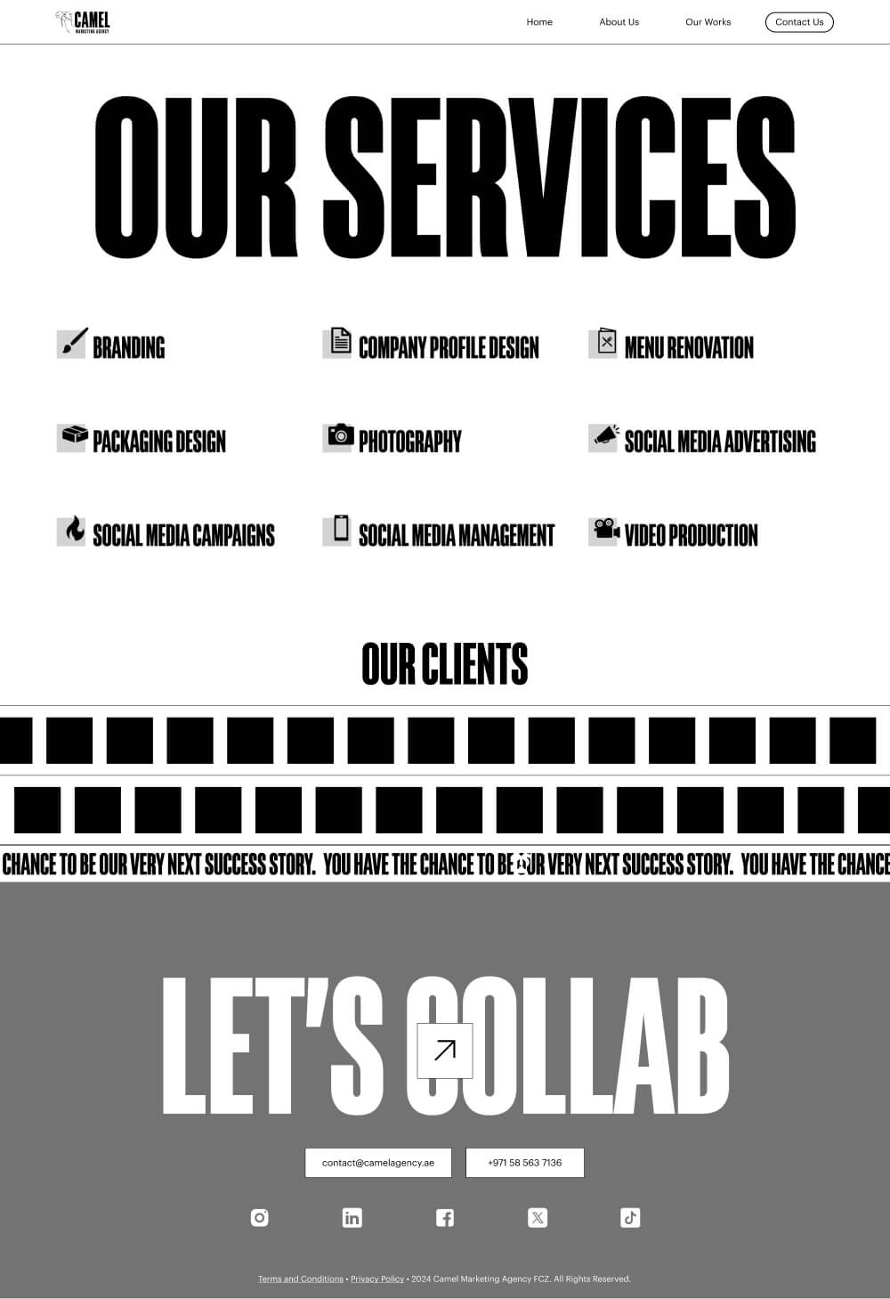
Since the Camel team wasn’t interested in a low-fidelity wireframe, I jumped straight into creating UI concepts to showcase the different styles I had crafted for them. This also accommodated their limited time for reviewing multiple design updates. The initial UI versions weren’t final—they were quick concepts meant to convey the overall feel.
However, as the project extended beyond the expected timeline due to multiple revisions, I eventually created a wireframe for the last variation. Given the budget constraints, an additional revision wasn’t feasible, so this wireframe became the final version of the design.
Preparing website assets
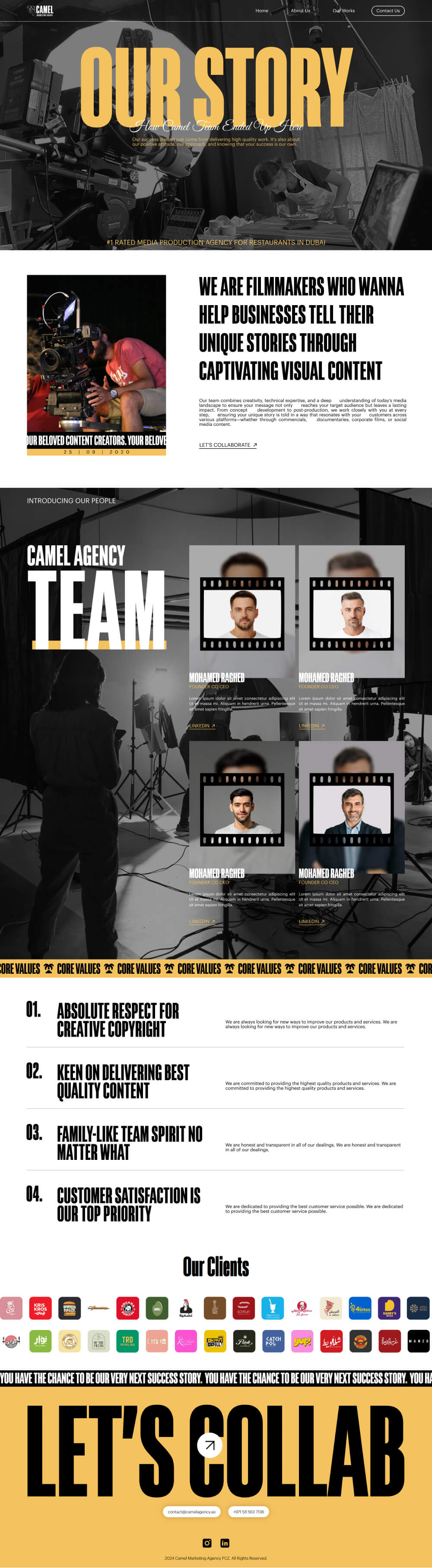
All the website assets featured illustrated elements representing a camel, the desert, and Dubai. The main difference between each set of illustrations was the artistic style. I created the vector-based illustrations myself, ensuring they aligned with the overall design. However, one variation required a hand-drawn illustration style, which wasn’t my area of expertise. To achieve the best result, I hired a graphic designer and provided her with clear creative direction to maintain consistency with the project’s vision.
design step
Creating High-Fidelity UI
For the high-fidelity UI, animations played a key role in storytelling, bringing the agency’s background and identity to life. Rather than using generic transitions, I designed animations that reinforced Camel’s narrative. Elements moved dynamically to reflect the agency’s journey, with smooth motion guiding users through the content in an engaging way.
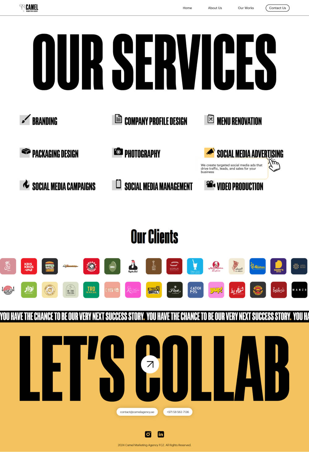
Past work section
I made a tab-window structure where the user can click on the service icon and the relevant past work will pop up, the websites service is chosen by the default.
First UI concept
The first concept was based on their preference for storytelling and a cartoonish look. The website was designed to be fun and engaging, narrating the story of the agency.
Second UI concept
Unfortunately, they decided to take a different direction with the illustrationss style, requesting flat vector illustrations instead of the drawn style. They also preferred fewer storytelling sections and more traditional layouts. This led to the second concept I presented.
develop step
Choosing the right tech-stack
Since this was a static website, I prioritized speed, efficiency, and ease of maintenance. I chose Astro.js, a framework I’m highly comfortable with, as it allowed me to build a fast, lightweight website while ensuring a smooth development process.
Given the project's tight budget, I couldn’t use the GSAP library for animations. Instead, I implemented them using vanilla JavaScript, carefully optimizing performance while maintaining a smooth and engaging user experience.